scrollingagainst(de)faults
as smartphone ownership grows exponentially throughout the world, scrolling has become a commonplace gesture in our everyday lives.
scrolling
enables us to



you're even doing
it right now.
let's give scrolling more than just a look.
hold to scroll
let's dig a little deeper,
and dismantle scrolling as we know it.

this web space defies how you scroll.
we apologise for any inconvenience caused.
(but not
really)

we
scroll
all
the
time
as scrolling is a default mechanism built into our digital devices to view content longer than the length of a screen.

these
principles
shape our expectations around scrolling,
such
that
the
screen
should
unfold
smoothly,
or that the proportion of screen movement should be equivalent to scroll movement.
these
expectations
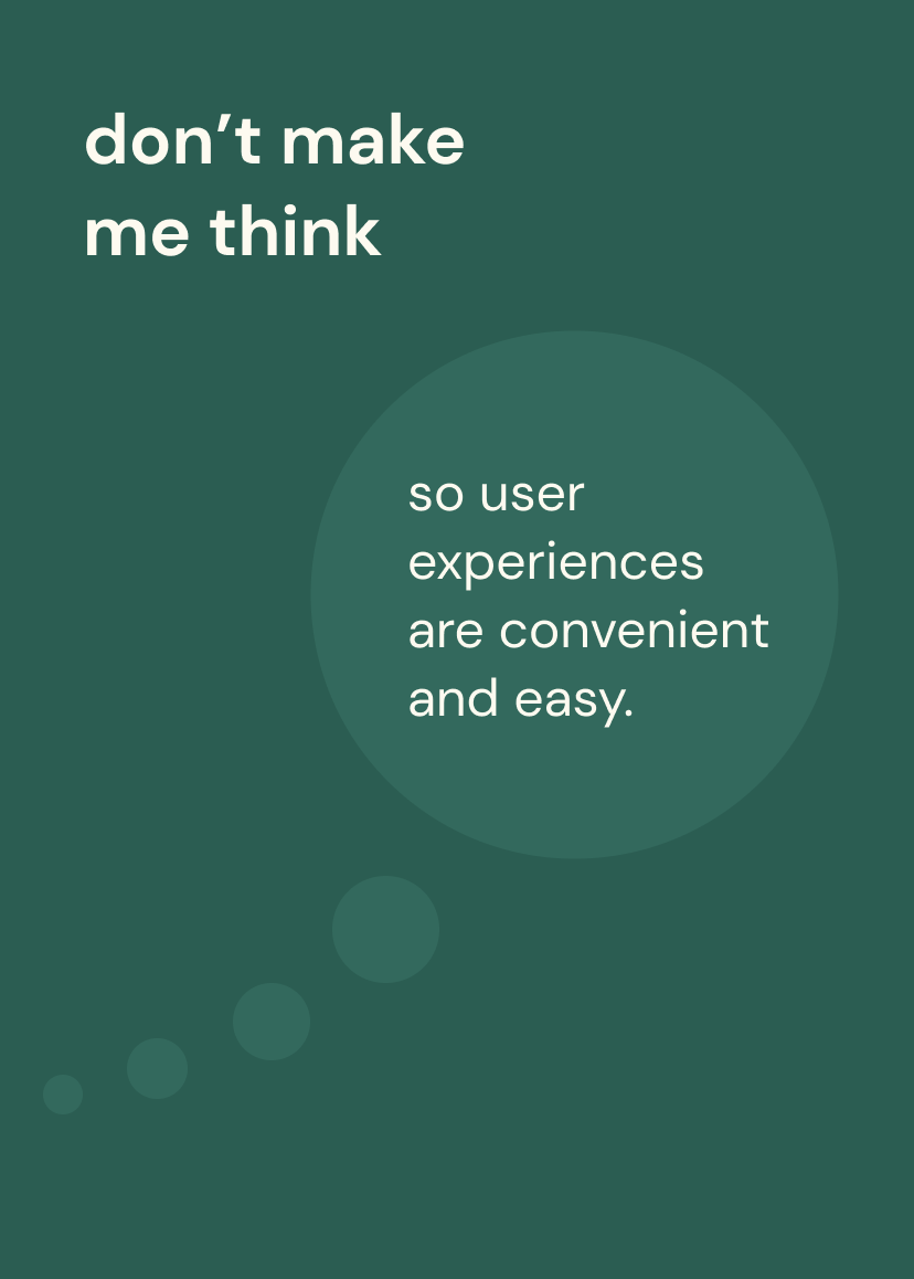
go hand in hand with the usability mantra:


yet, it is precisely because of these qualities that make it hard to stop scrolling.
this is most evident on social media sites that support addictive behaviour by being overly effective in making users continue scrolling.

psychologically, the infinite scroll triggers a dopamine loop effect similar to gambling.

without thinking, we scroll with anticipation that what unfolds next will elicit a higher dopamine hit.

but should we always scroll without thinking?
don't
don't
don't
don't
don't
don't
don't
don't
don't
don't
don't
let's
let's
let's
let's
let's
let's
let's
let's
let's
let's
make
make
make
make
make
make
make
make
make
make
make
make
me
me
me
me
me
me
me
me
me
me
me
you
you
you
you
you
you
you
you
you
think
think
think
think
think
think
think
think
think
think
think
think
think
think
think
perhaps we could slow the scroll down, highlight information that we usually miss out, so that we could pay more attention to important points or the fine print.
this could enable a degree of friction, an additional moment to pause, or a level of intentionality. and it might just make us think.


how might we challenge scrolling defaults?
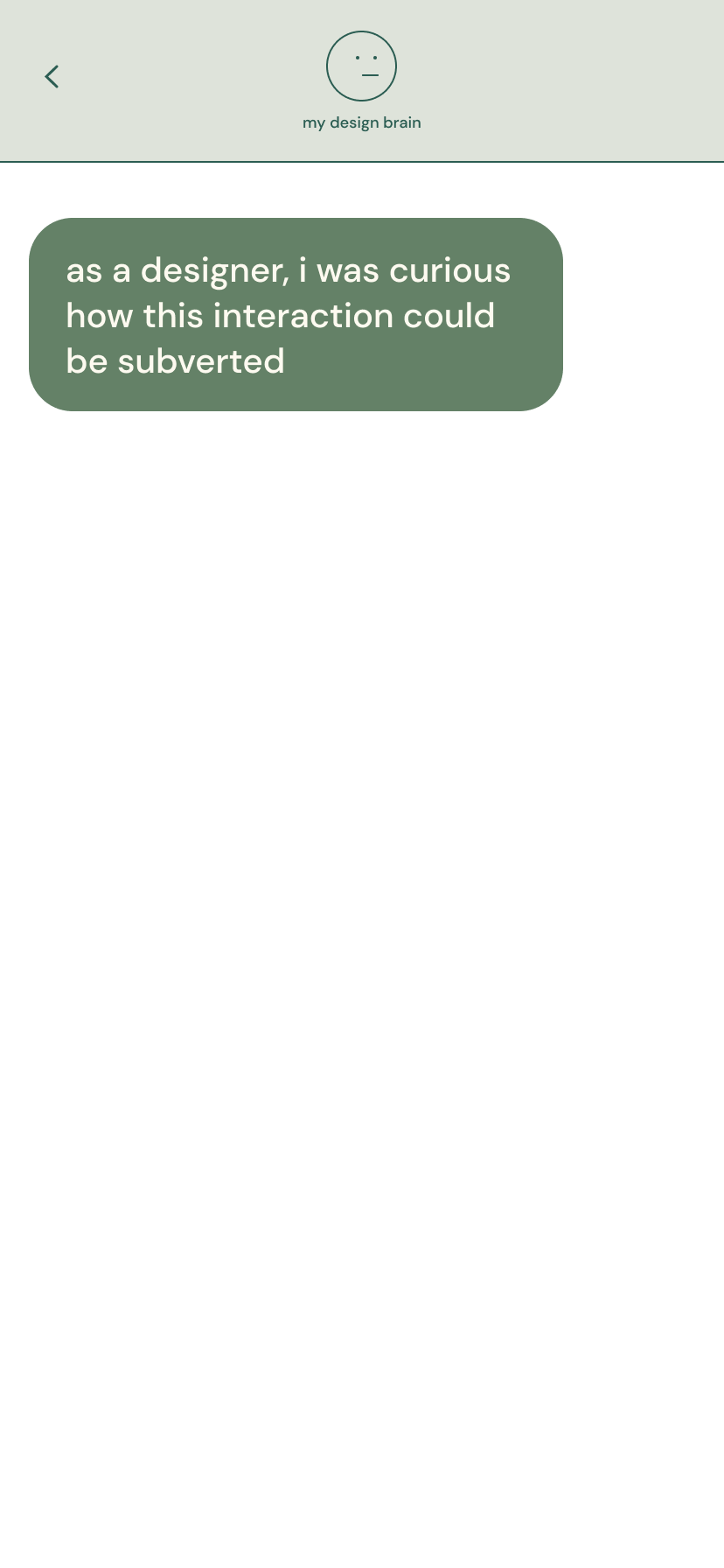


unsurprisingly, many programming challenges emerged while working against the defaults imprinted on our devices.
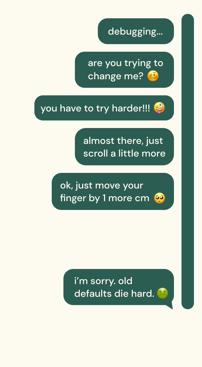
but in subverting the scroll, i discovered some new opportunities.
in the next section, i showcase my explorations on what defying scrolling defaults could look like.
i deconstructed the scroll to form a taxonomy of new scrolling patterns, alongside case studies that opens up a fertile space where the scroll can be embodied, emotive and emphasized.
in fact, you've already scrolled through some of these patterns yourself on this very page.
case studies
provocations that demonstrate how new scrolling patterns can be used for meaning-making in specific contexts.
pattern swatches
taxonomy of new scrolling patterns without any content, as well as some suggested applications and parameters of each pattern.
